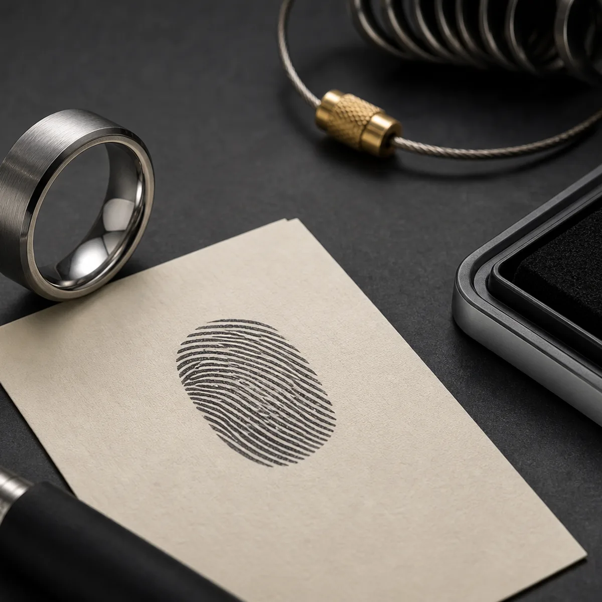

A memorial fingerprint ring is powerful because the design can carry identity at a literal physical level. That strength comes from one clear ridge pattern, not multiple attempts at decoration.
Start by choosing the single fingerprint source the family can trust. If there is more than one print, pick the one tied to the person's habit or ritual, not just the clearest file.
A ridge map needs contrast before it can become readable engraving. Low-resolution scans, glare, and soft pressure often erase fine lines before the design starts.
If the print is your main outside feature, use a tighter band profile so the mark has room to sit cleanly with enough depth.
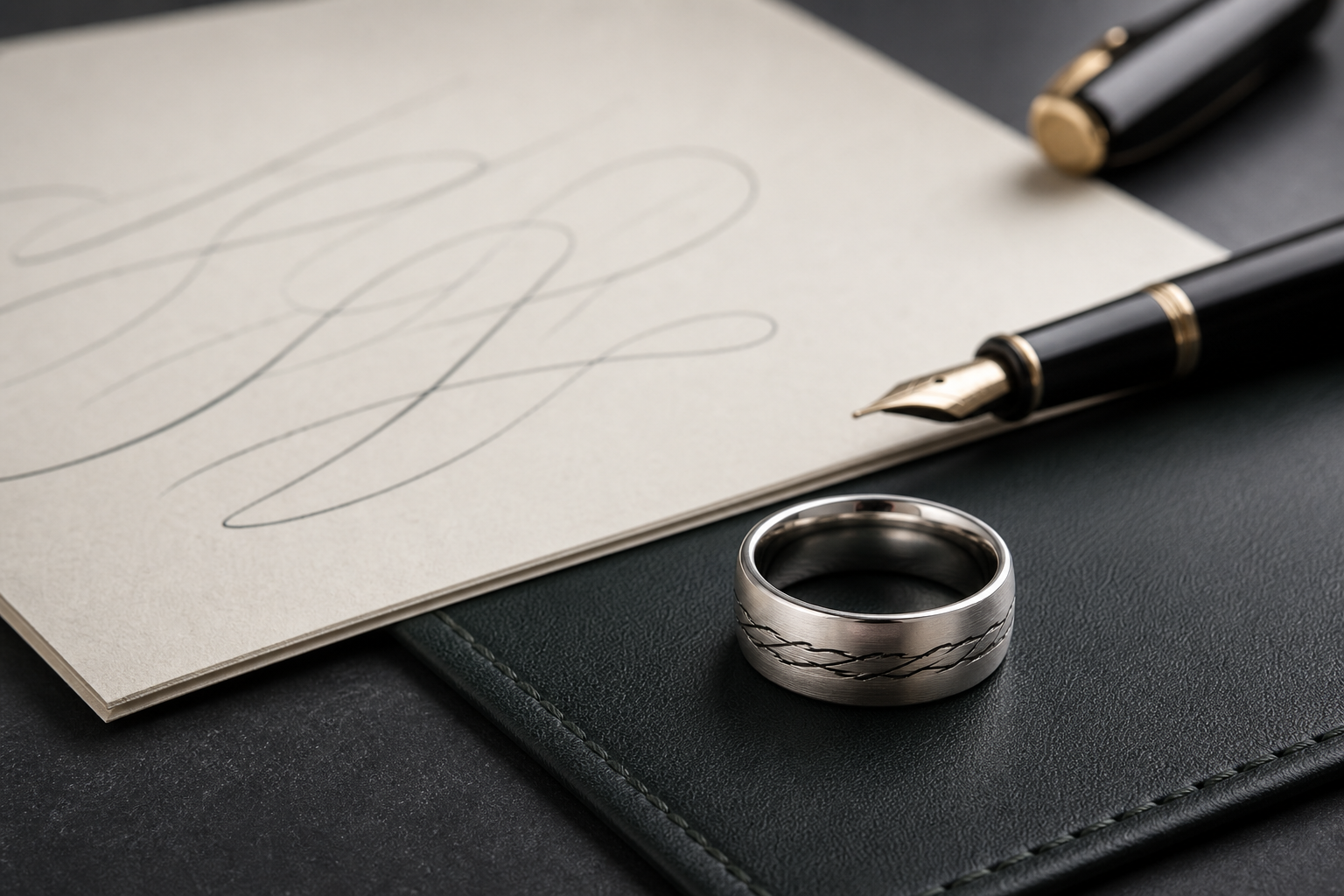
If the print sits on the inside, pair it with one short private phrase or date to keep the visual intent focused while retaining meaning.
Avoid pairing a full print image with multiple text lines. Most rings lose readability when both sides try to carry the full story at once.
Use one relationship term, one date anchor, and one supporting symbol if needed. Everything else belongs in a family note, not the ring.
Decide whether this ring is for daily wear and reassurance, or for occasional wearing as a statement. That choice changes placement and text size.
One final check: does the ring still feel like this person when viewed from normal ring distance? If not, simplify again before opening the designer.
Then bring the final print crop, exact spelling choices, and the one phrase into the Friends of Irony designer.