
Photo memory is emotional because it already carries a relationship before any design choices happen. The ring should protect that emotional anchor, not expand into too many symbols.
Start with one photo and one purpose. A wedding portrait, family snapshot, porch scene, walk-in-the-sun, or quiet object in the background can all become a source, but only one should lead.
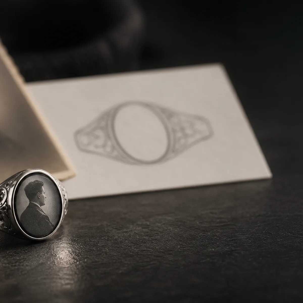
If the photo is the outside element, reduce it to a silhouette or shape that can still be recognized after simplification. Fine detail is often lost at ring scale, especially during daily wear and cleaning.
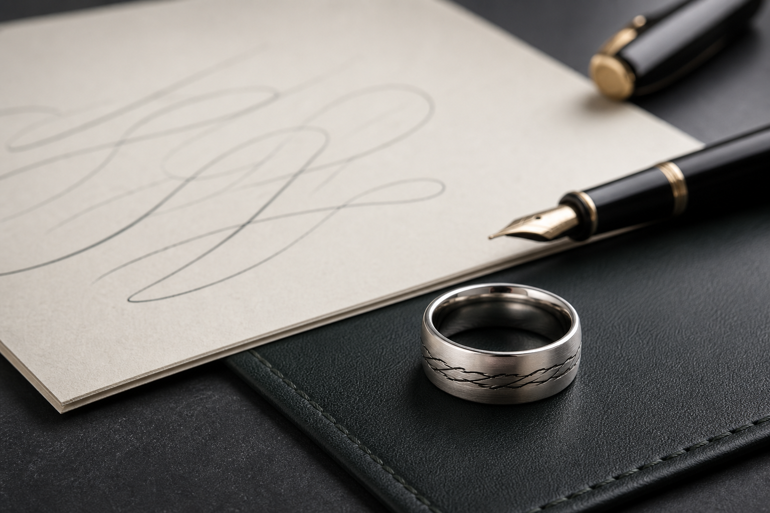
If the photo is the inside anchor, allow more nuance in phrase, date, and symbol while keeping the outside cleaner. The inside should carry the private layer of the story.
Name and date choices are stronger when they match how the family refers to the person. Keep spelling and relationship references exact to reduce revision risk.
A common mistake is trying to include too many visual cues from one photo. If the source has several meaningful objects, pick one and leave the rest for the note, date, or engraving.
Ask who will wear the ring every day. A busy wearer may need larger text contrast and fewer micro details, while a ceremonial keeper can hold a slightly denser source.
If the family has multiple photos, use the clearest one that can be simplified reliably. Extra photos usually create a draft problem, not a stronger design.
Before opening the designer, prepare one original file, one cropped close-up, and the exact phrase or date you want to keep readable at small scale.
When the photo source, phrase, and placement are set, move into the Friends of Irony designer with one clear version and a backup text-only version.