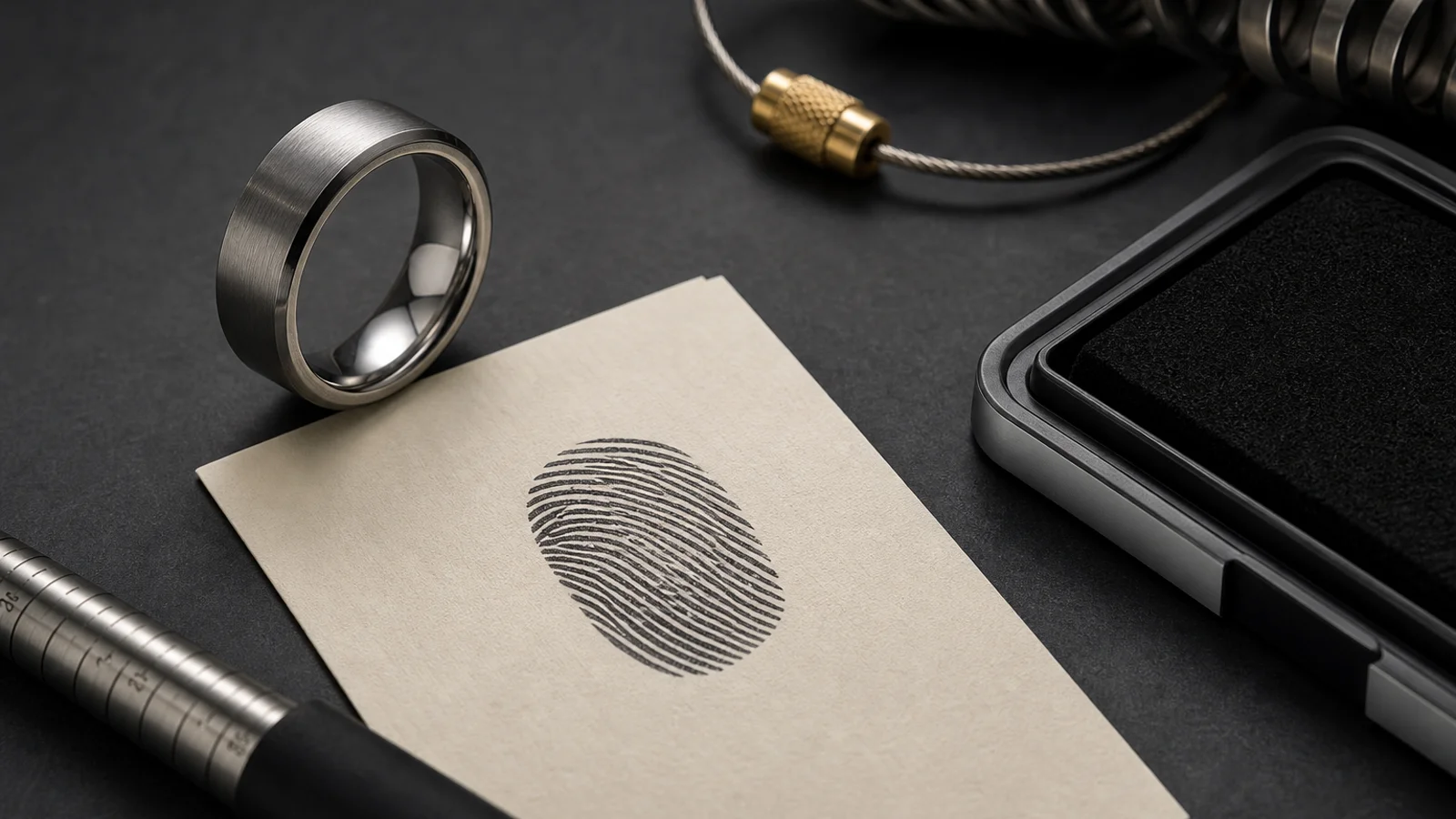

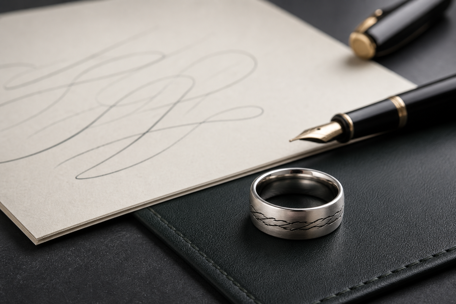
When families ask for both a print and handwriting, the desire is often to preserve two kinds of proof: the body's unique mark and the voice of the loved one.
That is a good intent, but both sources compete for space. The practical solution is to make hierarchy explicit before design starts.
Pick one source as the outside anchor. If the print is the emotional center, keep handwriting to one concise line inside or near the edge with careful spacing.
If handwriting is central, simplify the print to a single cleaned patch. Most successful combinations use reduced prints with strong loops rather than full raw image transfer.
Avoid decorative fonts and excessive flourish when using handwriting. A clean, simple engraving style usually protects the authenticity of the writing.
For sensitive names and dates, verify spelling and spelling order first. A correction after engraving request is expensive and emotionally stressful for the person carrying the story.
Use finish selection as part of emotional tone, not just aesthetics. A matte or brushed finish can make tiny lines easier to identify as they age with wear.
Test the phrase length by reading it at shoulder distance. If a phrase needs repeating before it lands on the first read, trim it to one anchor phrase.
If the original handwriting is too stylized, isolate one short word or initial and reserve the full note for your personal memory file, not the ring surface.
End with one clear layout rule for the designer: which element is visible to everyone, which is private, and where each belongs on the ring.