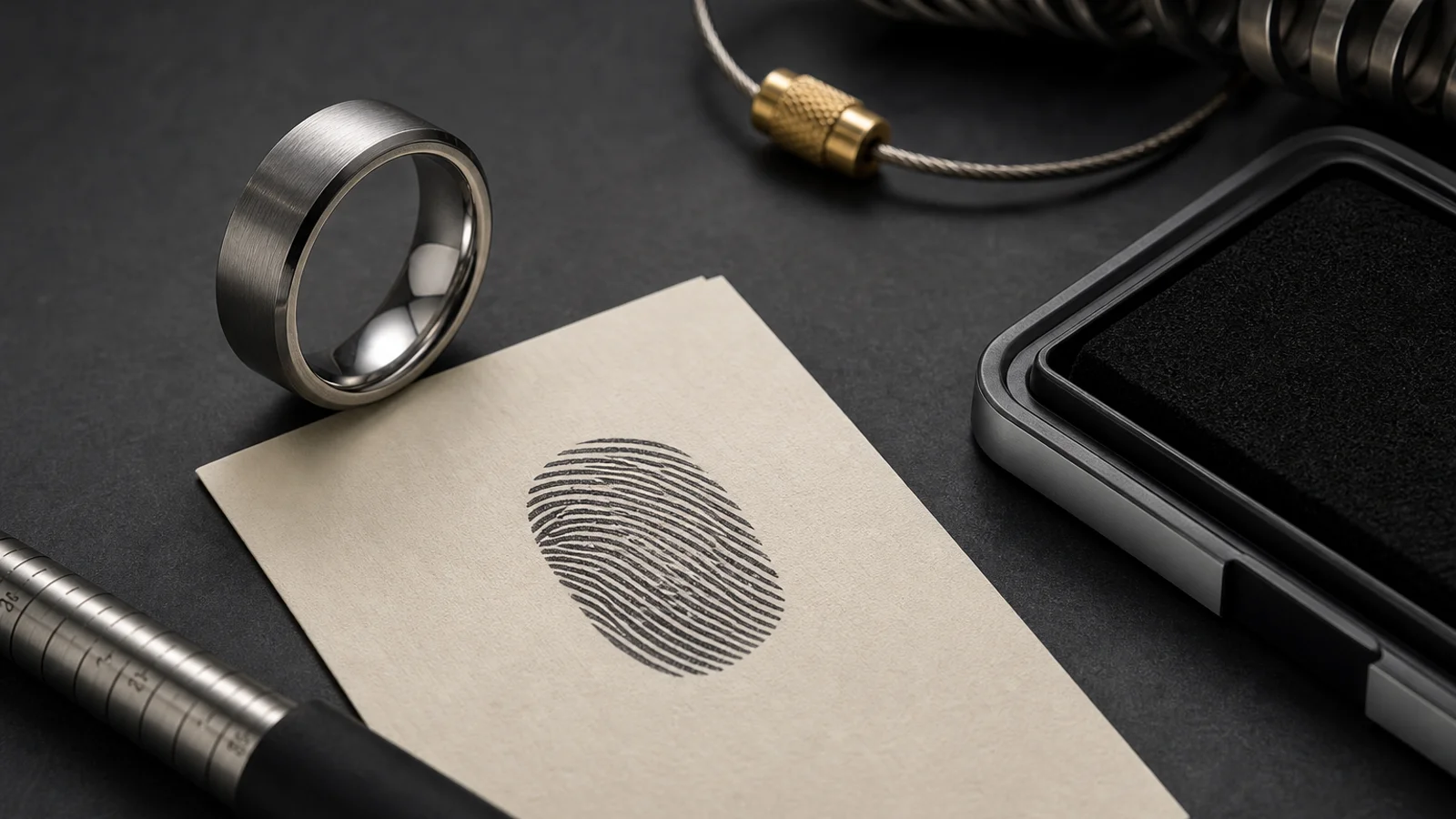

A fingerprint is dense by nature, and this is why many memorial rings lose impact after engraving. The raw print often contains too much visual noise for a narrow band.
The first practical step is to define where people will usually view the ring. A ring on a workbench can be read differently than one worn while driving, gardening, or running errands.
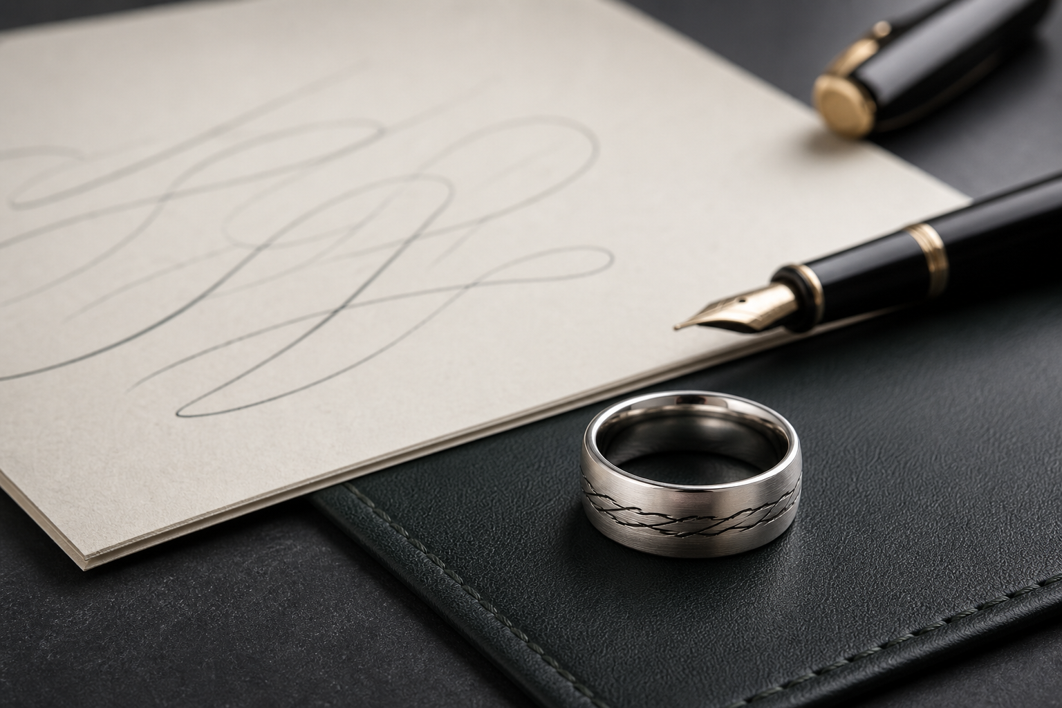
When you optimize for readability, keep the outside side minimal: one readable source mark and one short human anchor like initials, a date, or a short phrase.
The most common fix for blur is not stronger contrast alone. It is reducing the ridge count so the lines remain visible when your eye passes over the ring at normal speed.
Choose one outer ring zone for the print and treat all other details as secondary support. If the design has too many secondary marks, the fingerprint loses priority.
If the print source is too grainy, a second higher-clarity photo is cheaper than repeated redesigns later. A high-resolution source usually yields cleaner engraving paths and fewer edits.
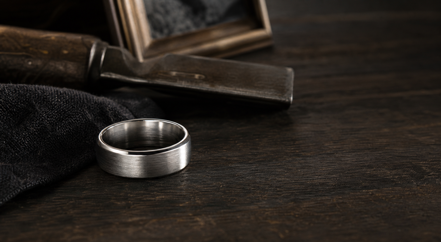
Finish matters early in the process. Brushed silver with darker texturing often preserves ridge distinction better than a polished plain surface over time.
Keep the private inscription separate from the outer print. A private line can add emotion without reducing the readability of the outside mark.
For custom fit wearers, keep all text and symbols inside the wearer's life context. A name and one date can protect readability while still carrying meaning.
Review the source file in grayscale at tiny scale. If it still feels legible before the ring exists, the final design has a stronger chance to read well.