
Placement is one of the most underrated decisions in memorial ring design. Many grievers default to outside-first choices and only later realize they wanted more private control.
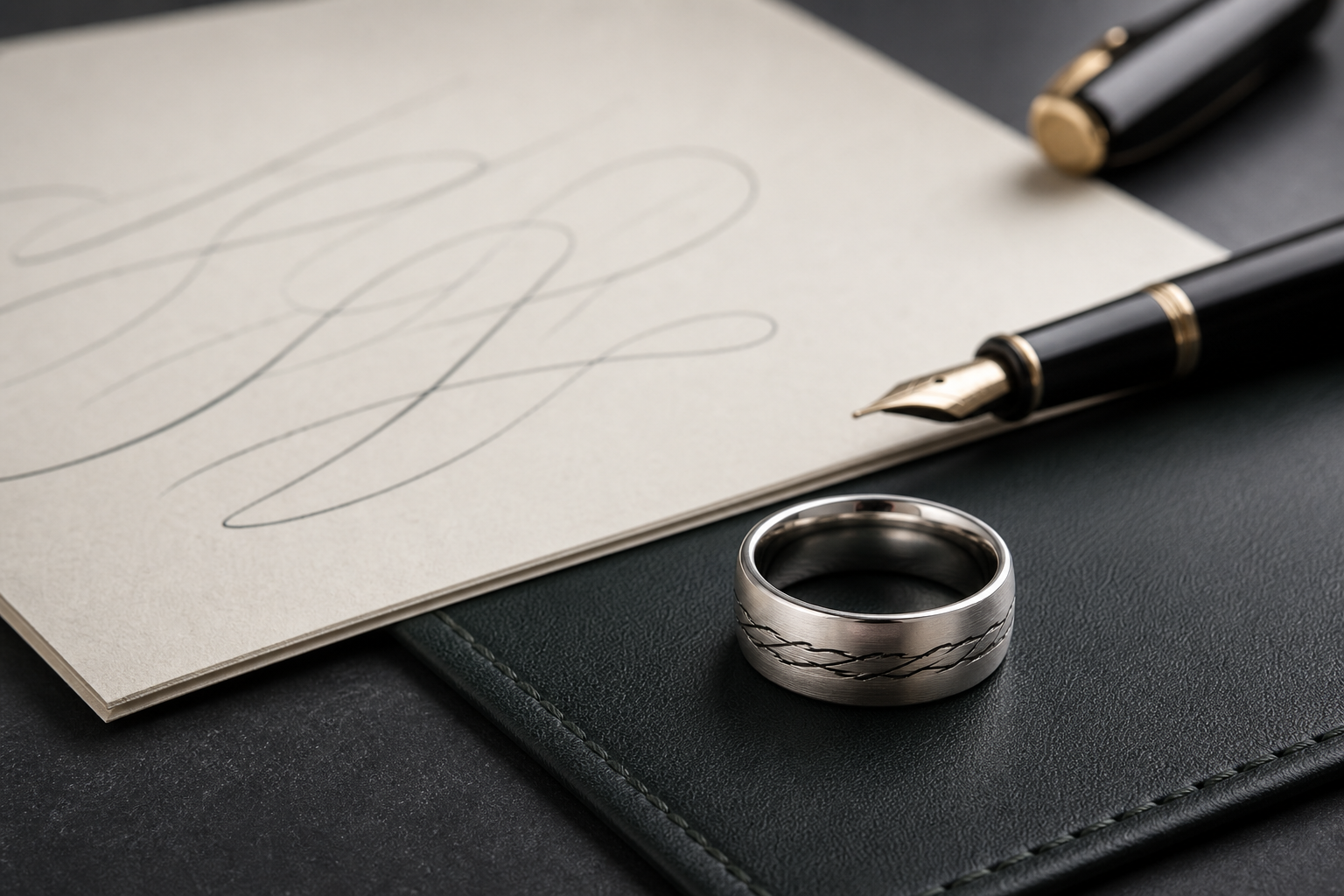
Outside placement communicates recognition, service, and connection in public. Inside placement protects a private conversation with the wearer that can carry a date, phrase, or private symbol.
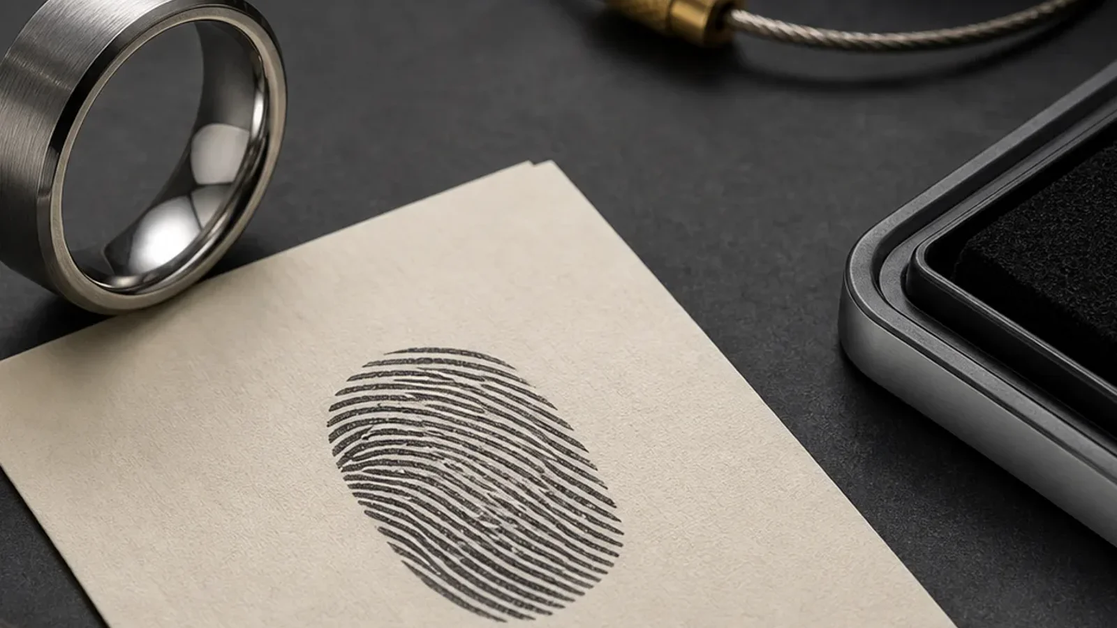
When the print is the primary external memory, set name and date as secondary supports, not equally weighted rivals.
For owners who work daily with hands, prioritize comfort first: a simple perimeter and fewer edges prevent accidental wear over time while preserving clarity.
If there is a recurring phrase from the person, inside placement often holds that emotional detail better than an exterior crowding scenario.
Use the band width as a design constraint. A wider band allows an outside print without forcing a heavy, crowded composition.
For couples or close relationships, the outside can carry the most public symbol while inside can hold a personal phrase only the wearer needs to revisit.
One practical rule: if the wearer has to pause and study the ring to read it in full, it is probably over-designed for its purpose.
Keep the outside visual in two weight levels only. Too many levels of detail in a small area can make the ring feel ornamental instead of meaningful.
Before finalizing, preview the ring as if it will be the one thing you touch during a hard day. If it still feels calm and clear, placement is likely right.